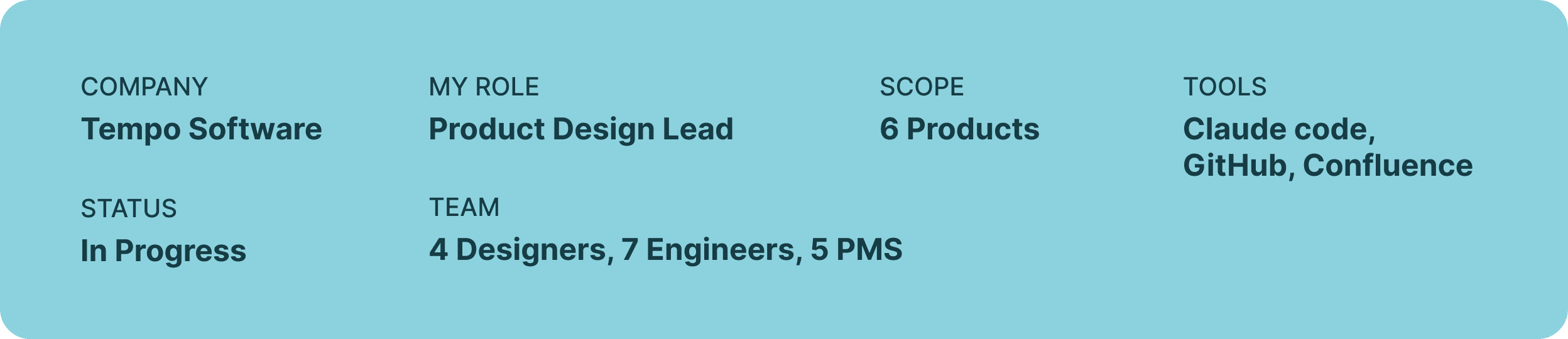
Ecosystem unification
How I revived a stalled design systems initiative by doing the product work, not just the system work


Problem
Fragmented user experiences, multiple component libraries and UI kits with no clear path on unification
Solution
Rather than rebuilding the component library in isolation and expecting teams to adopt it, I took the opposite approach: start with a real product flow, update the components that live in that flow, and let the system grow from real product work.
The situation
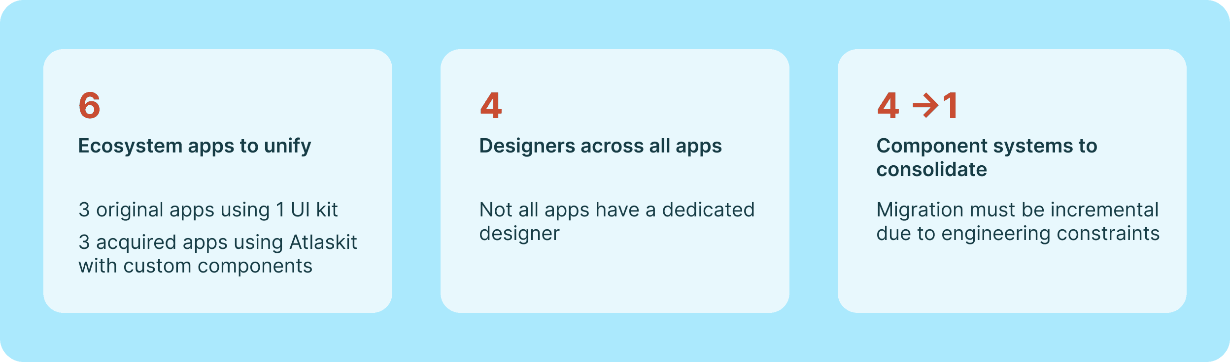
Tempo Software grew through acquisition. What began as three tightly-scoped Jira apps expanded into a product suite with 6 apps within the Atlassian ecosystem and 2 standalone apps. The original apps had been built on a proprietary UI kit. The acquired products used Atlaskit. No shared design language existed. No unified component library. No governance.
From a customer perspective, the differences were subtle but cumulative: inconsistent interaction patterns, visual mismatch across navigation and data surfaces, and no coherent sense that these products belonged to the same family. From an engineering perspective, teams were maintaining multiple component systems in parallel with no resolution in sight. From a business perspective, the fragmented ecosystem created real risk: a signal to prospective partners and investors that the portfolio lacked cohesion.

How we got here
The unification effort had been attempted before I owned it. As a Senior IC, I collaborated on early groundwork alongside a designer who was nominally leading the initiative. When that designer left, the project lost its owner and quietly died. No documentation. No roadmap. No stakeholder alignment.
The Shared UI kit a Figma library paired with a coded component library in Storybook built on shadcn, existed in partial form. It had potential, but no adoption strategy and no governance model to maintain it.
I saw an opportunity to restart the initiative with the strategic framing it had always lacked. The internal goal was clear: the company had ambitions for growth, and a product suite that looked like separate apps rather than one platform was a real obstacle to that goal.
I chose not to reframe this as a design debt story. Design debt doesn't move PMs or executives. Business outcomes do. I positioned the unification work as a prerequisite for feature quality and customer retention, and tied each redesign effort to a product roadmap priority that already had stakeholder buy-in.
Working with real world constraints
The external constraint: Embedded in the Atlassian ecosystem as an independent brand
These products live in the Atlassian marketplace, which creates natural pressure to align with Atlaskit's visual language. But Tempo's strategic direction is toward platform independence: building a product identity that can stand on its own outside the Atlassian ecosystem. That means Shared UI must be distinctly Tempo's, not a derivative of Atlaskit.
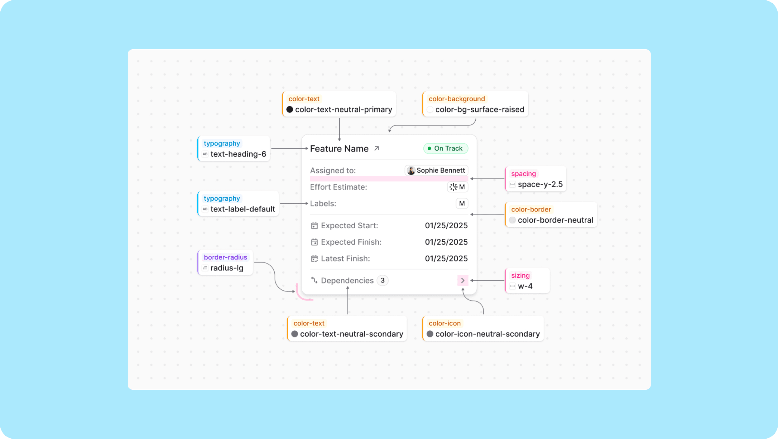
The system today
The Shared UI library now includes documented foundations across tokens, color, typography, icons, spacing, elevation, and accessibility, authored by the design systems team and published in Supernova for all product teams to reference.
The strategy
PMs prioritize shipping features that solve customer problems. Design system work competes for the same engineering and design time. Any strategy that couldn't demonstrate near-term product value was going to lose that competition every time.
Rather than rebuilding the component library in isolation and expecting teams to adopt it, I took the opposite approach: start with a real product flow, update the components that live in that flow, and let the system grow from real product work.
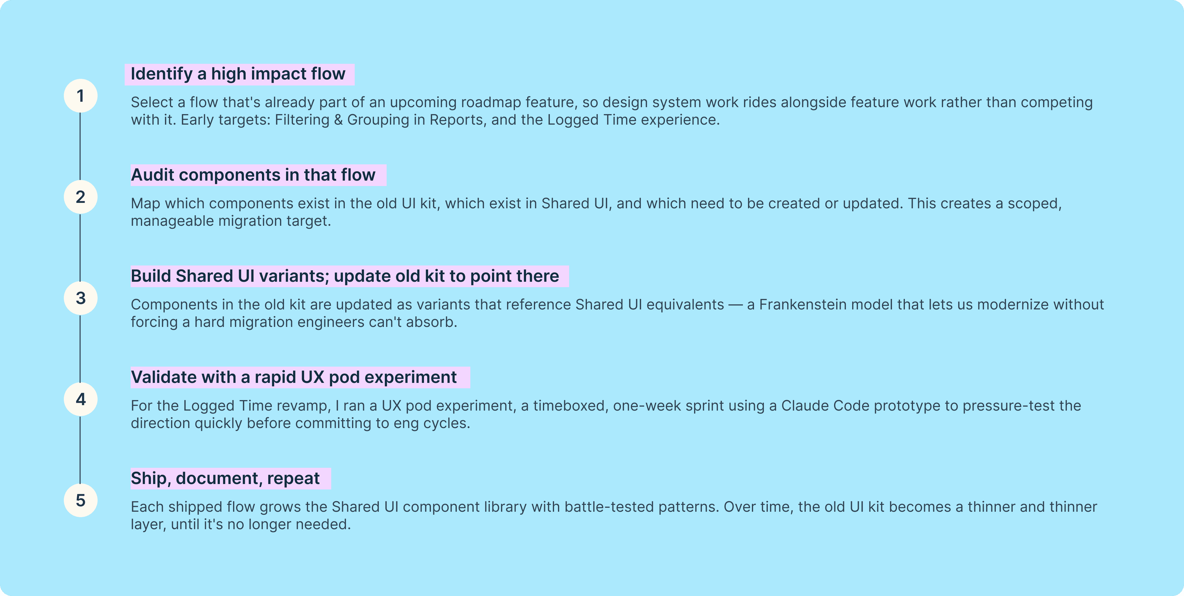
The flow in practice
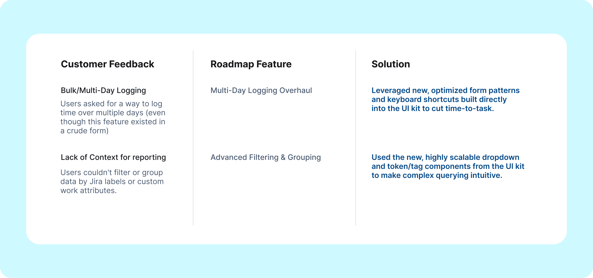
Multi-day logging and custom filtering were our highest-frequency, highest-friction workflows. By leveraging the new Shared UI Kit to redesign these experiences, we achieved a dual business goal:
Protecting ARR (Annual Recurring Revenue): We directly addressed the top feature requests driving renewal churn risks.
Efficiency through UX pods: Increased velocity for prototype to testing from 3 weeks to 1 week. The prototype existing in a GitHub repo reduced engineering handoff friction.
The UX pod
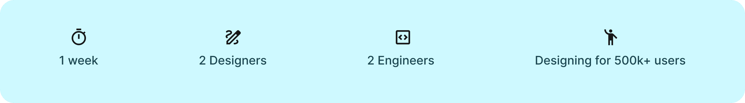
The first real test of the flow-first strategy was a week-long UX pod focused on the Log Time experience in Timesheets, which is used by over 500,000 users and is one of the highest-frequency interactions across the product suite.
I assembled a small cross-functional team of 2 designers (including myself) and two engineers. I made sure our goals were clearly defined: audit the current experience, identify UX improvements, and pressure-test feasibility from an engineering perspective before we implement the redesign.
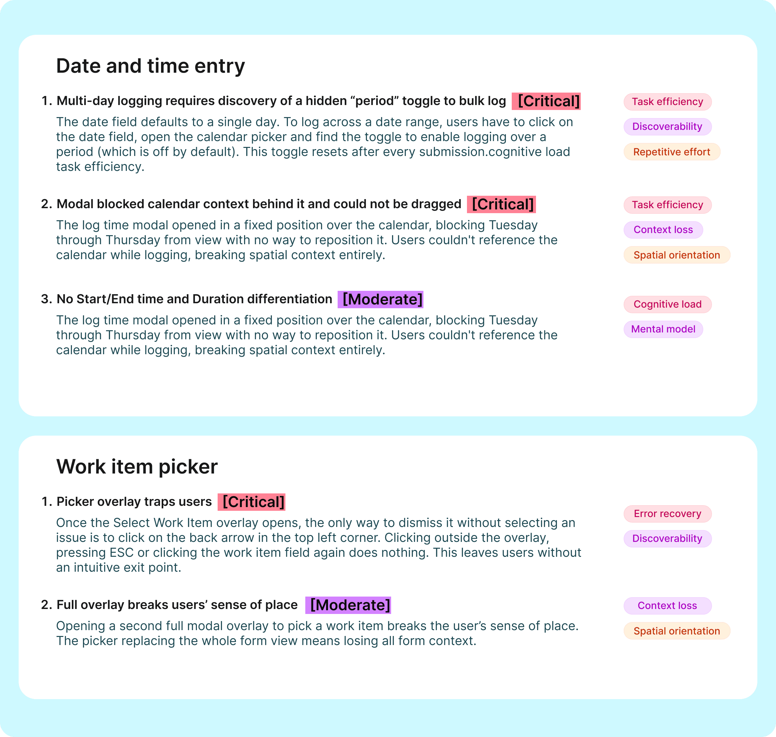
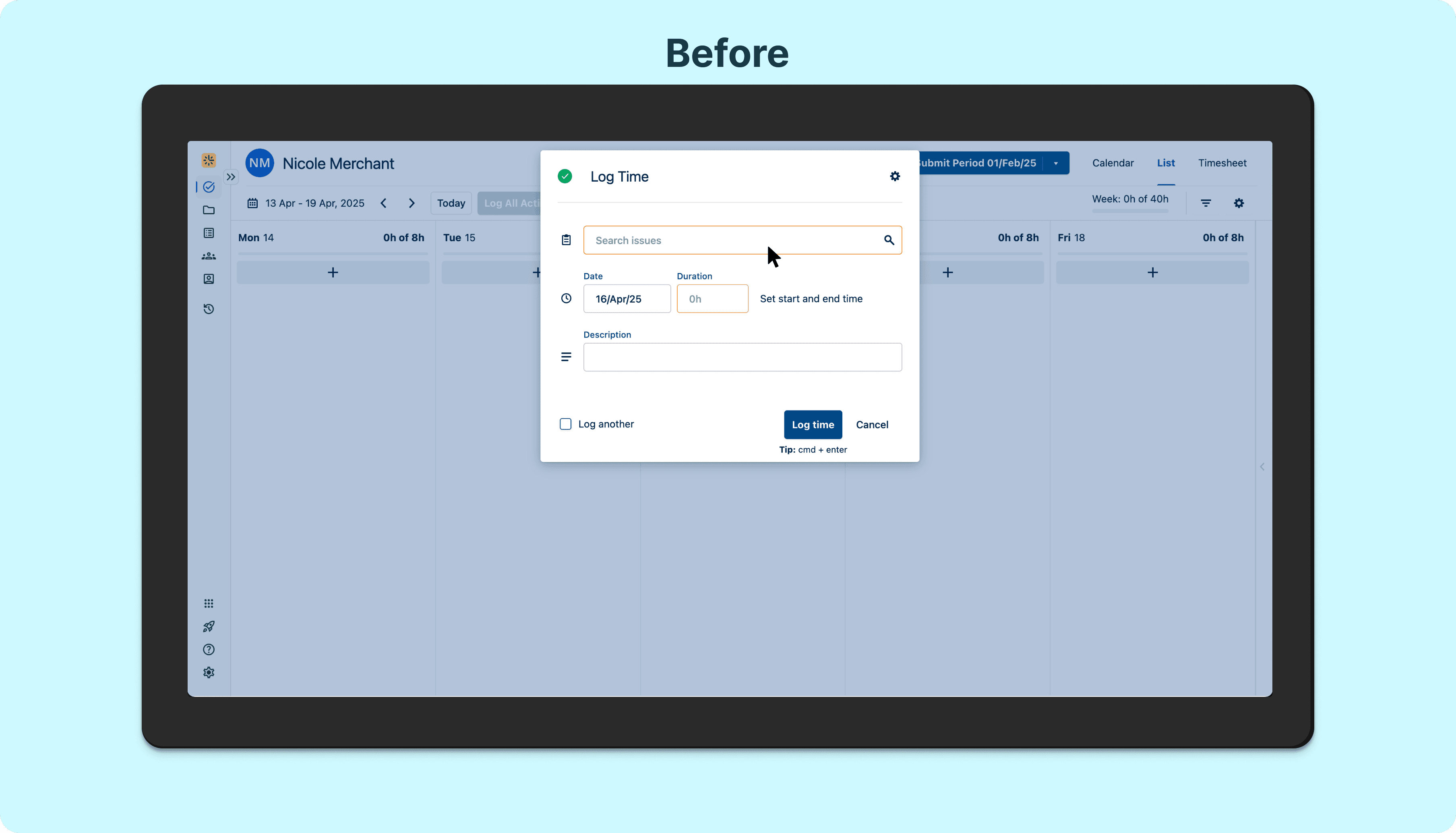
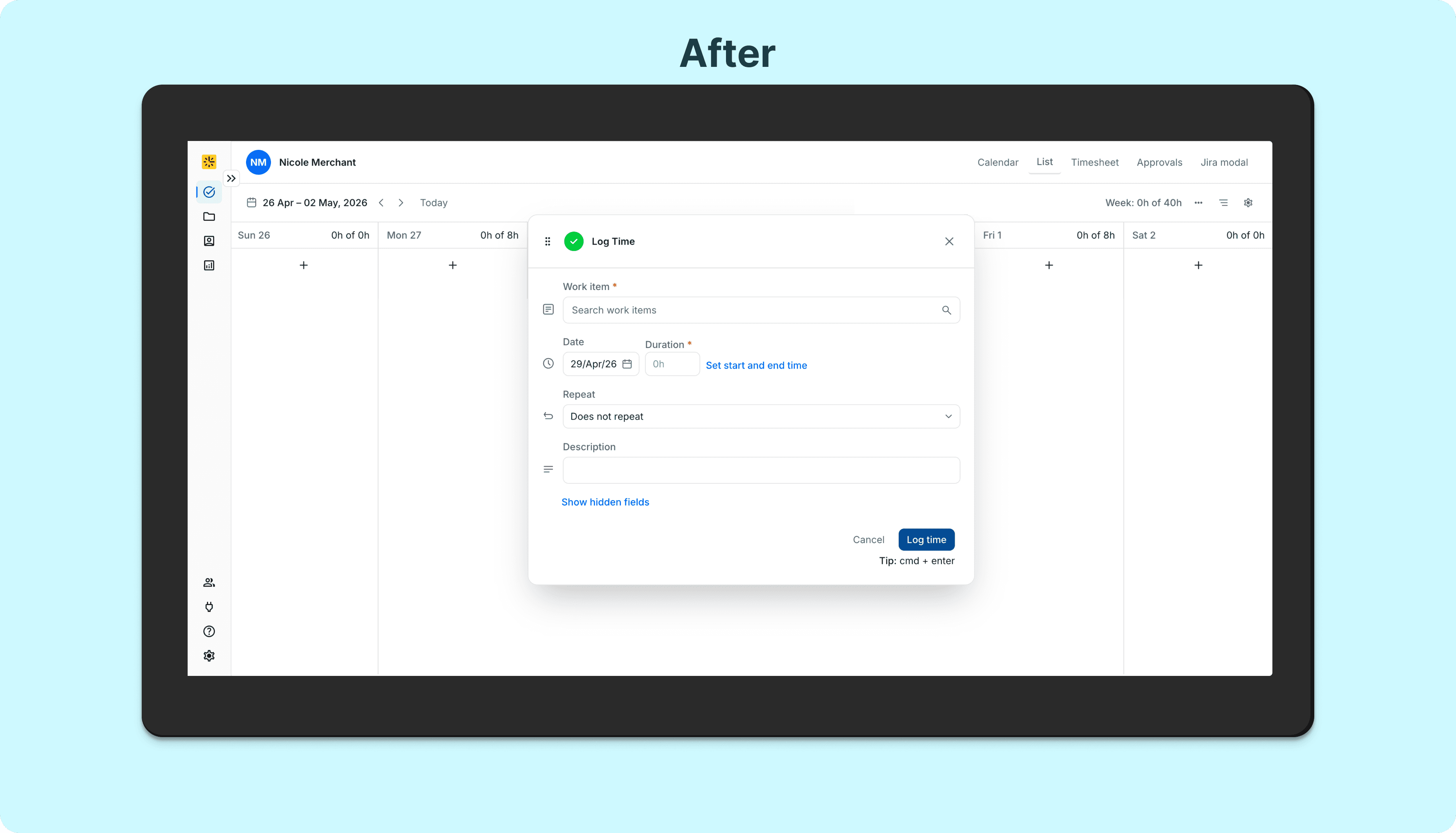
The audit surfaced issues organized by severity. Critical issues included friction in a multi-day logging flow that required users to rediscover a hidden Period toggle on every single submission, even when logging recurring entries, a modal that blocked the calendar context behind it and a work item picker that trapped users with no escape except the Back button (violating standard modal dismissal conventions). Moderate issues included Start/End time and Duration coexisting in the form with no live feedback communicating their relationship to each other and the work item picker overlay breaking the users' sense of place.
A key structural decision came out of this audit: replacing the full modal overlay to select a work item broke the user's sense of place — disappearing the date, duration, and description they'd already entered. The solution moved toward a dockable side panel that preserves form context while the picker is open.
The Design team has a new workflow where we create prototypes in a prototype-playground GitHub repo and use Claude Code to rapidly prototype. This let us create a functional code prototype to evaluate via usability testing.
Research methodology
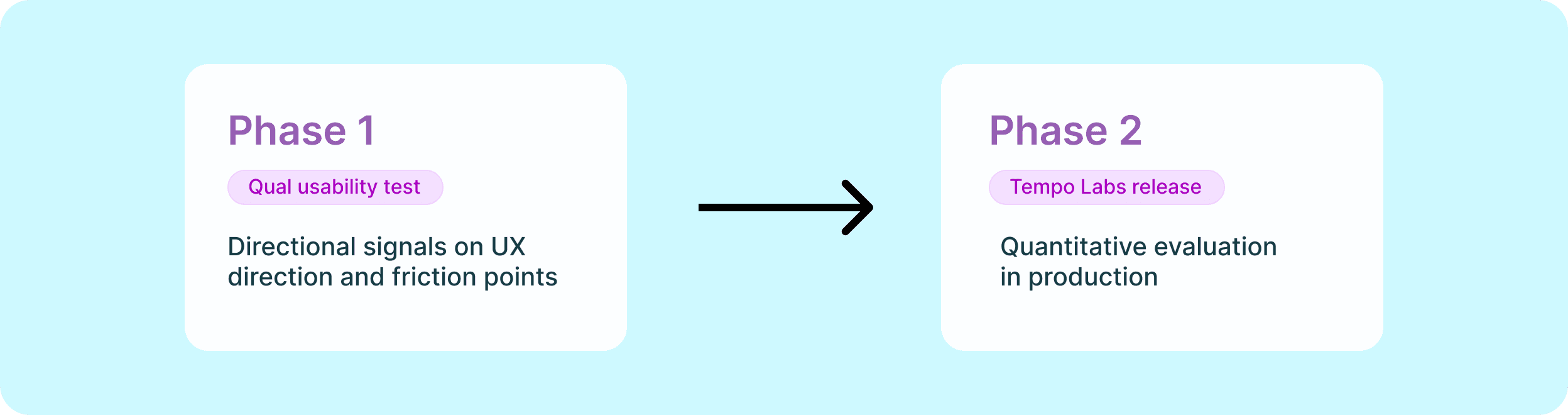
Phase 1: Pre-Launch Usability Testing (Qualitative & Directional)
The Goal: Validate user mental models, discover immediate workflow blockers, and refine the UX copy.
The Method: Conducted moderated usability sessions using our live GitHub/code prototype.
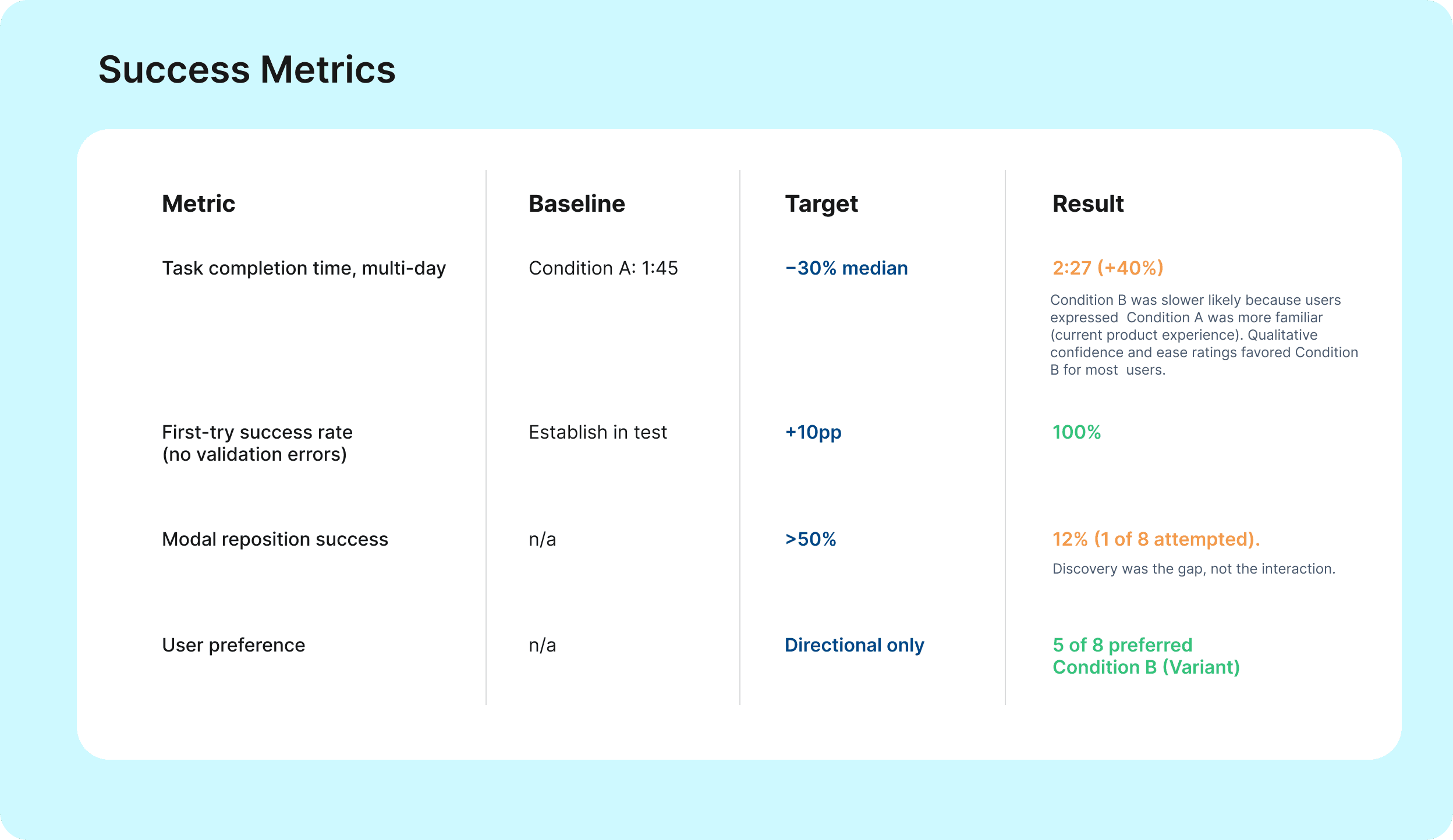
The Focus: Because we were looking for directional insights, we focused on behavior over numbers: watching where users paused, how they conceptualized bulk-logging, and if the new UI kit components felt intuitive.
The Outcome: Caught two minor layout issues in the multi-day form before a single line of production code was written.
Phase 2: Phased Labs Release (In Progress)
The Goal: Validate real-world adoption, performance, and usage trends at scale.
The Method: Release the redesigned flow behind a feature flag to our "Labs" cohort (early adopter customers).
The Focus: Monitor users in production to track quantitative deltas (such as success rates, time-to-task, and drop-off rates) comparing the new flow against the control.
The Outcome: Make tweaks based on live behavioral data feedback from Labs users before full rollout.
Outcomes and learnings
Since restarting this initiative with a flow-first strategy, we have rapidly accelerated system adoption across the product ecosystem:
4 core user flows updated across 3 distinct apps.
12 new components added or modernized within the Shared UI Kit.
Currently scaling this exact framework with designers across 3 additional applications.
Flow Evaluation: Log Time Redesign
The Log Time overhaul was the ultimate test of this model. Usability research with 8 participants evaluated the redesign's core direction, with 5 out of 8 users explicitly preferring the new flow.
More importantly, it proved that the strategy held up: real product work successfully drove component development, and component development produced immediate usability gains worth testing in Labs.
The Strategic Shift: Merging System & Roadmap
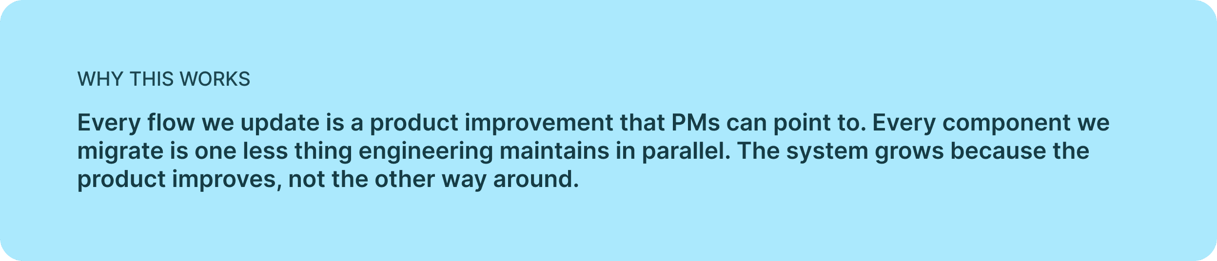
The broadest strategic outcome is organizational: design system work no longer competes with the product roadmap for prioritization.
The system now grows because the product improves, not because we lobby for system work as its own line item.
For Product Managers: Every flow we update is a tangible user experience improvement they can point to on their roadmap.
For Engineering: Every component we migrate represents one less legacy asset they have to maintain in parallel.
This fundamental reframing is exactly what unblocked a design system initiative that had stalled twice before, and it is what makes this work doable to product teams who don’t traditionally see themselves as "design systems people."

